Background
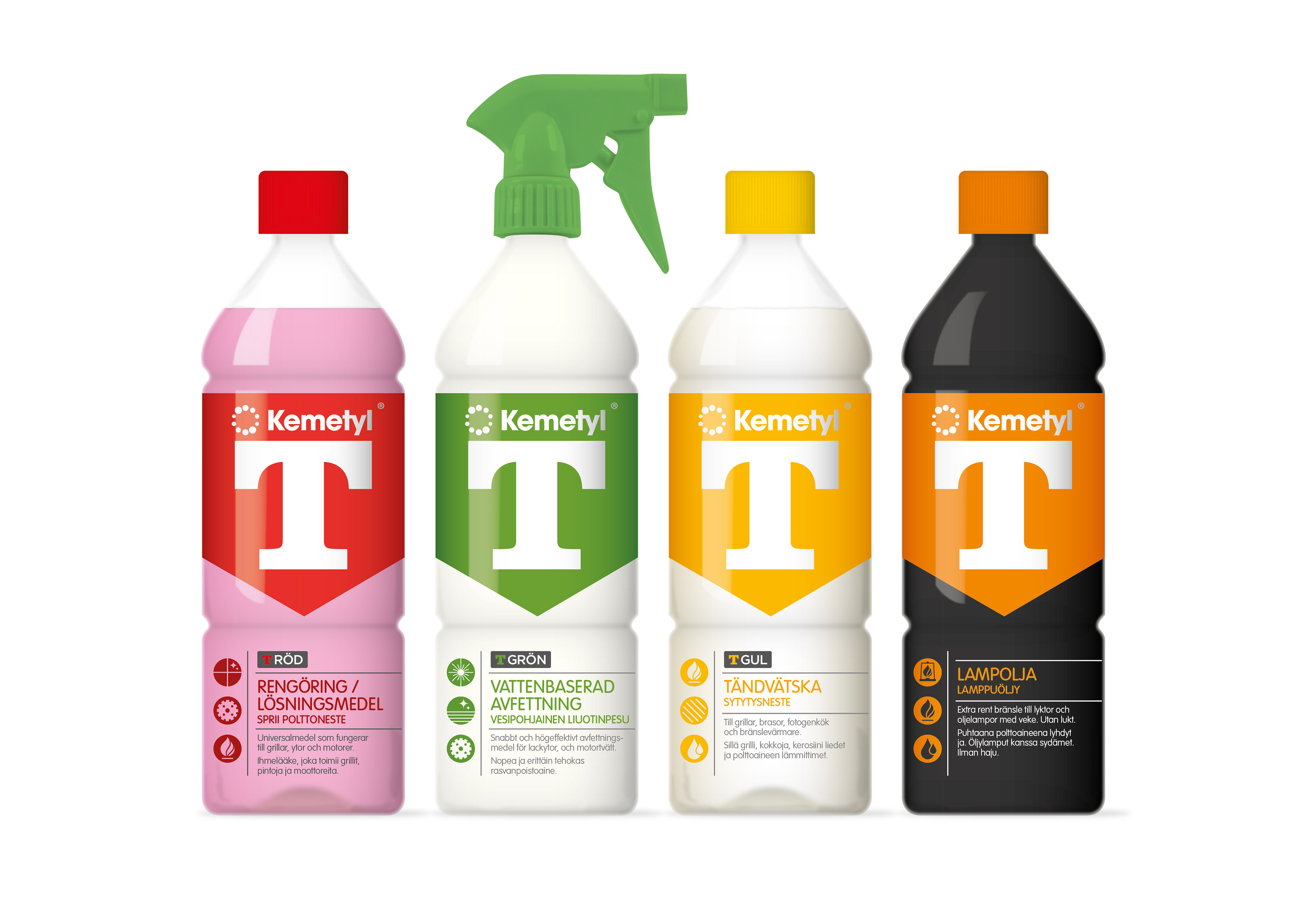
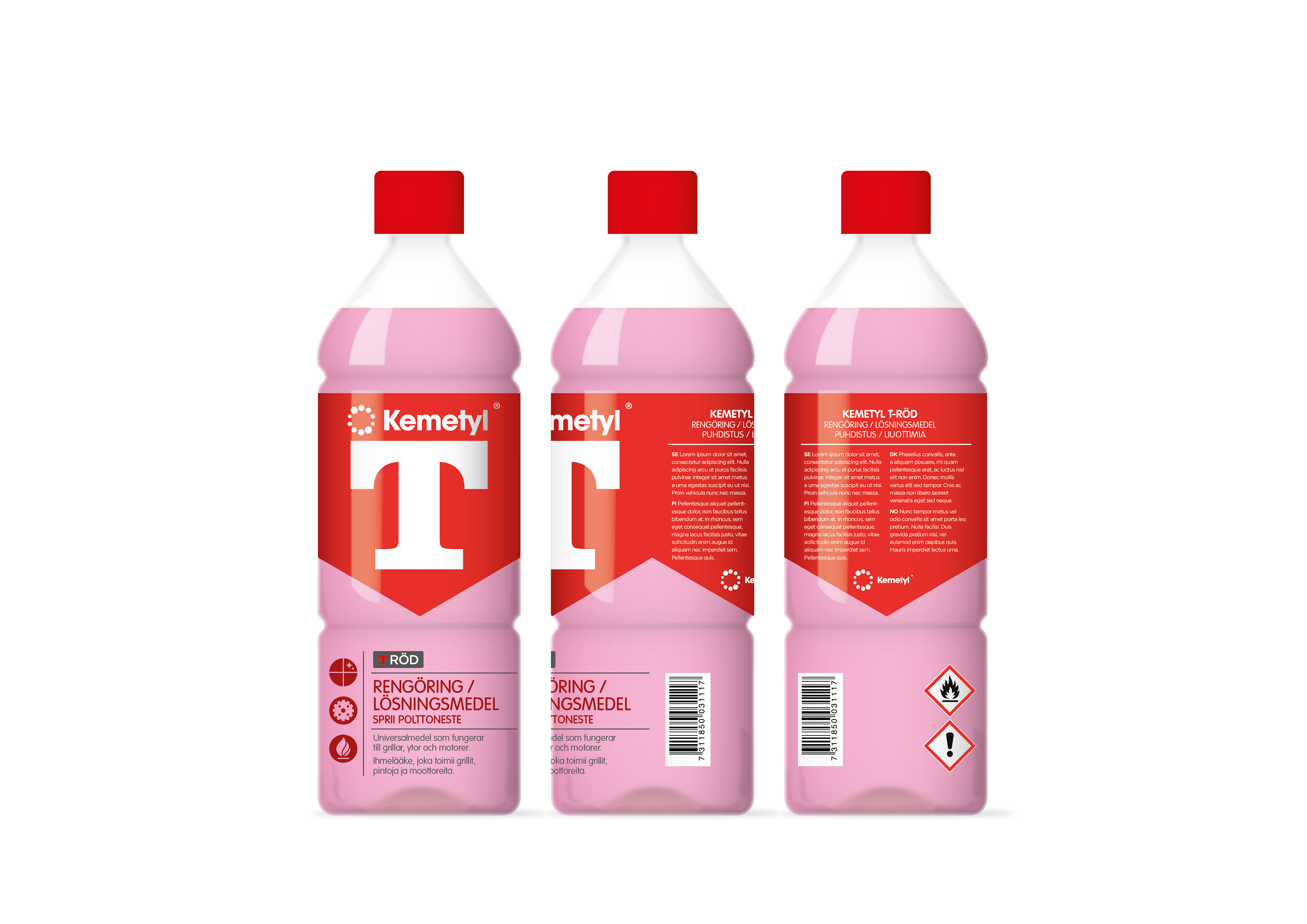
A classic brand with an extensive range of spirits from lighter fuel to cleaning solution. The T-Spirit range had expanded over the years and become inconsistent to the brand heritage. Now the master brand Kemetyl wanted to consolidate the entire look.
The Idea
The upper-case ‘T’ (short for Tekniskt) is an essential feature of the brand and takes a prime place on pack, giving a stark statement on shelf and strengthening the brand heritage. The logo is framed within a dynamic form giving more presence to the range. All information was restructured and
a library of symbols was developed to simplify usage areas of each product.
a library of symbols was developed to simplify usage areas of each product.
The Result
The new design gives the T-Spirit brand a coherent look that is both stark and simple for consumers to use. The range has a strong presence on shelf whilst maintaining the original essence of the brand. The Kemetyl master-brand logo was redrawn for use on packaging allowing it to be anchored well within the overall design.