Background
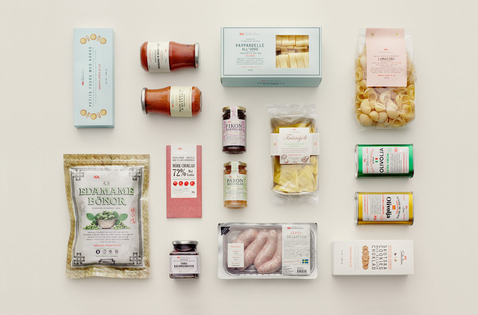
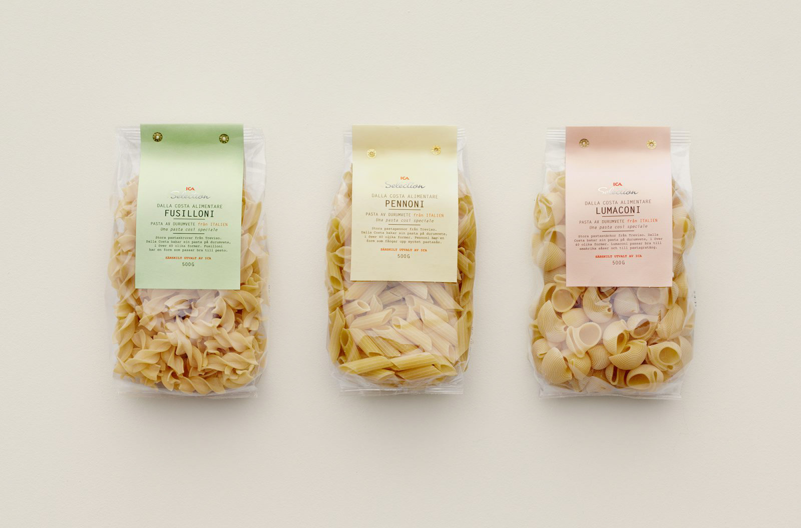
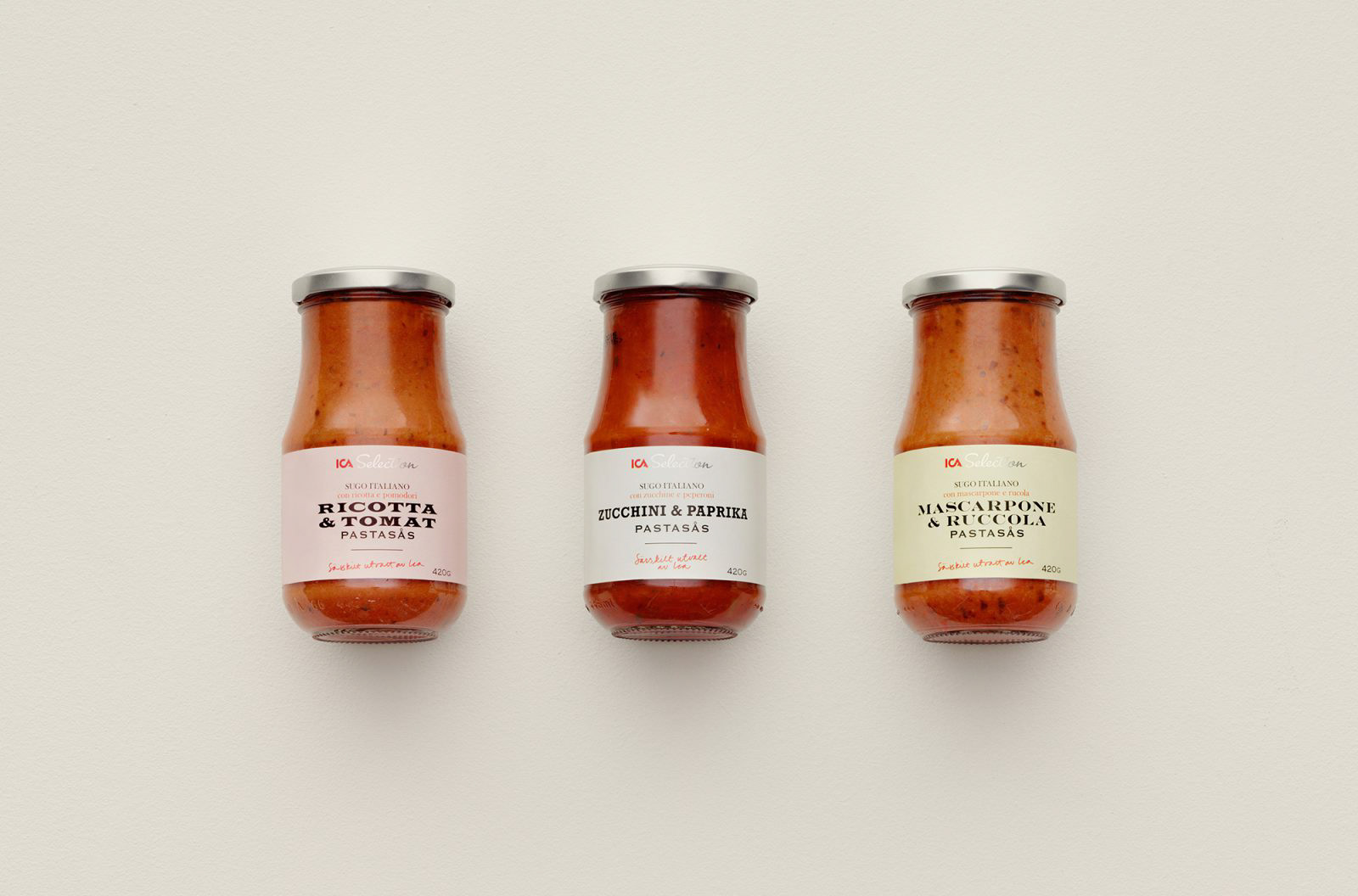
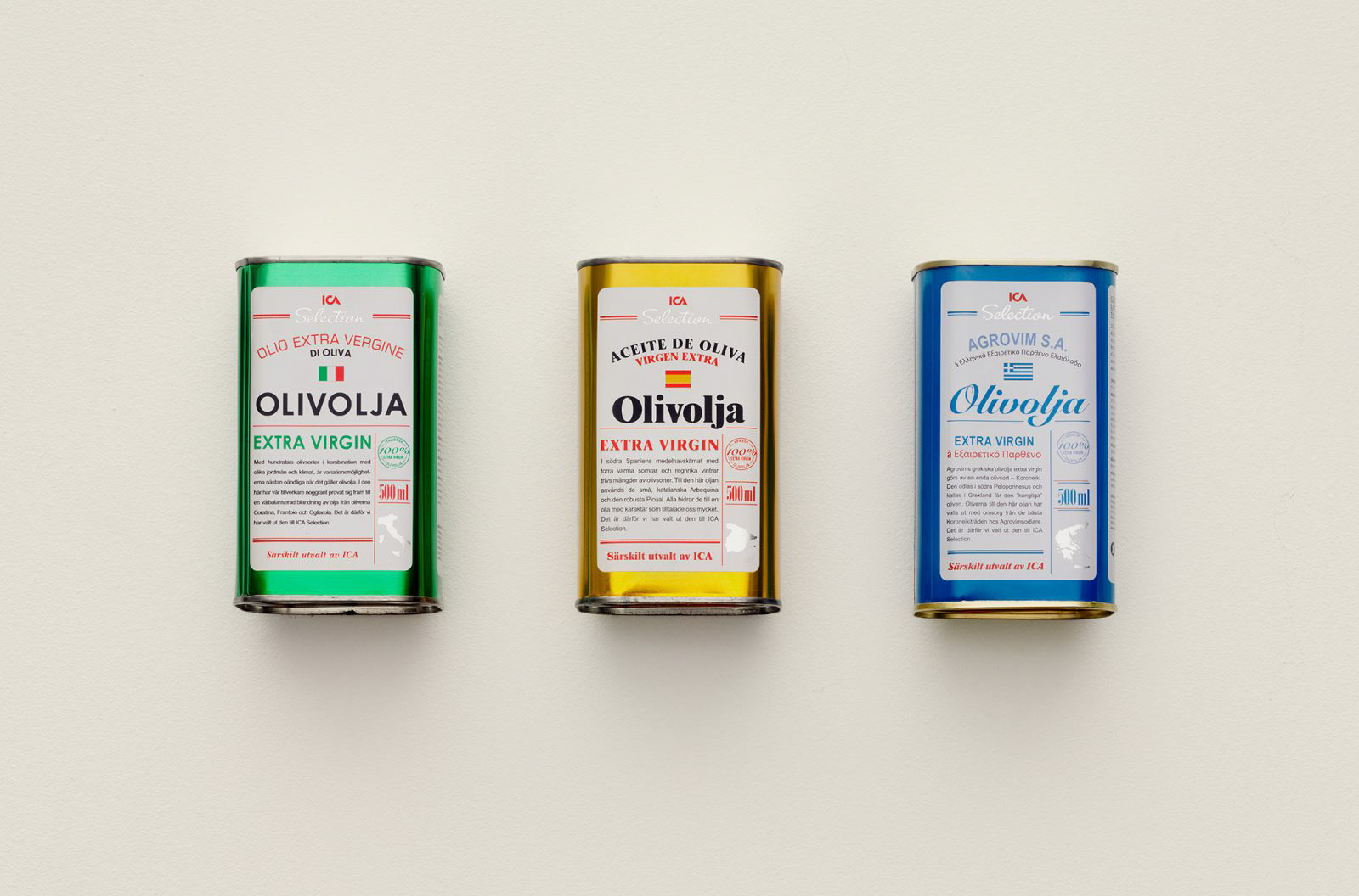
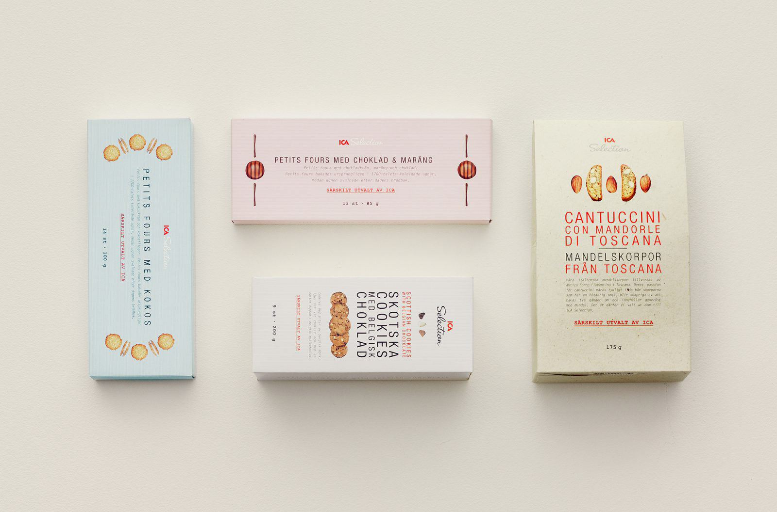
ICA Selection is ICA’s range of premium products sourced from around the world. They are carefully picked from specific regions with products of the highest quality. ICA wanted to see a new design that didn’t use the standard graphics once associated with premium products.
The Idea
What would a these products look like if the producers created the labelling themselves? Simple, honest and authentic.
The Result
An information hierarchy was introduced displaying the product names in original languages, all typeset in fonts referencing default settings. Where possible the product would be visible to display its fine quality. Tactile materials would be used to enhance the authentic feel. By using a graphic style referencing the hand-made labelling of locally produced goods, the range now had an authentic feel with no frills. The quality of the produce would now be able to speak for itself.
The design won a Red Dot award in 2012 and Resumé Månadens Design (Design of the Month).