Background
Although a well established brand, Druvan had become dated and dull and needed to turn over a new leaf. The brand needed a new modern identity that would bring life to the range and inspire consumers to use their products in fresh and exciting ways. The range was also to feature new bottle designs and a premium segment of their finest products. Three designers were brought in to pitch concepts for consumer testing.
The Idea
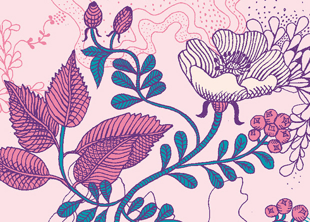
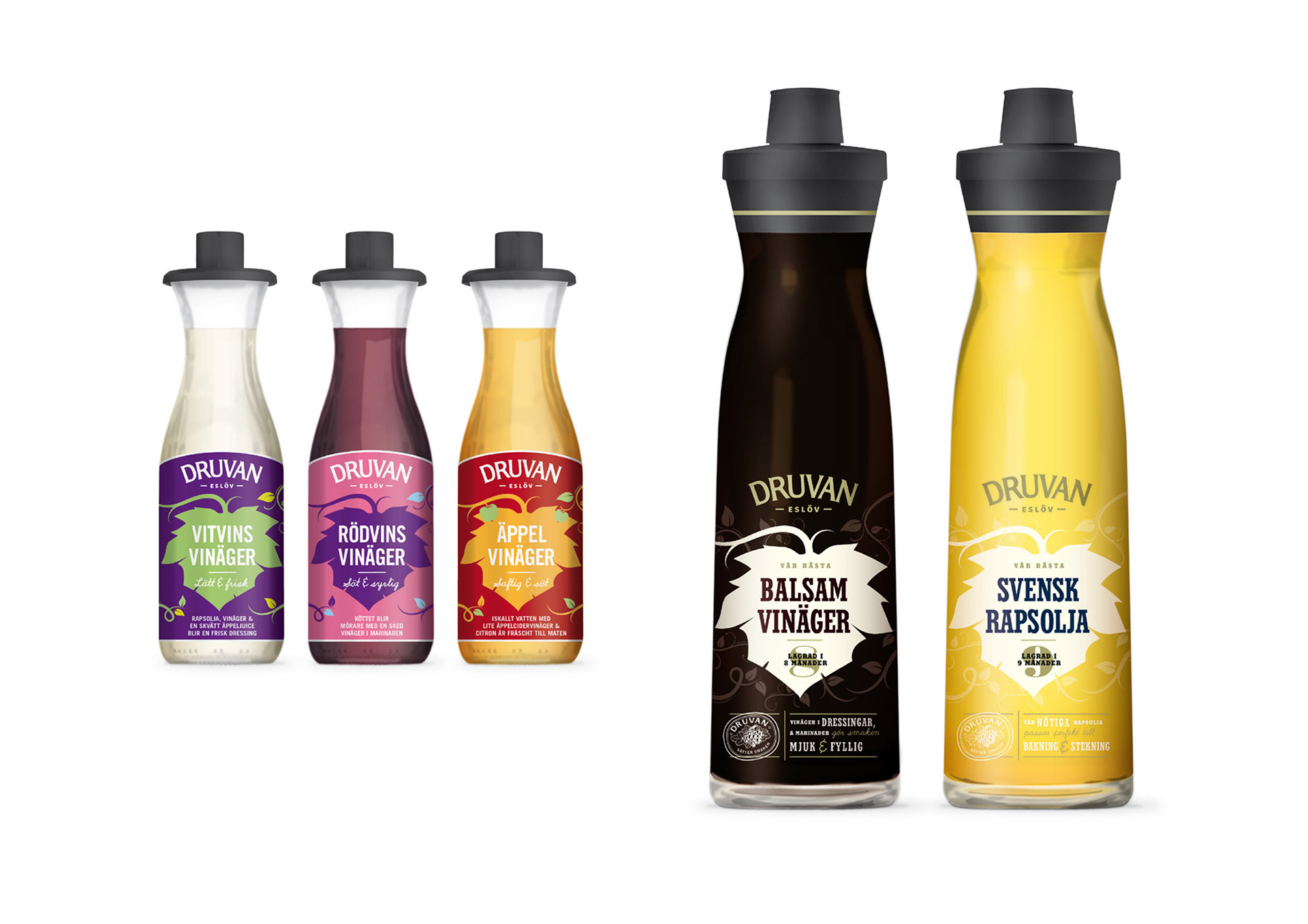
Druvan literally means ‘The Grape’. The winning concept used the simple approach of a vine leaf graphic as a link to the brand name, and as a means to highlight flavours within the range. It stems from Druvan’s vinager-producing roots and references the original vine leaf illustration once used.
The Result
The bold graphics and vibrant use of colour brings out the true flavour of Druvan, making it easy to find the right product on shelf whilst enhancing the brand. The playful packs included flavour enhancing tips to get consumers experimenting in their kitchens. The premium range would see new bottle designs with a mix of classic typography, tactile spot varnishes and glistening gold graphics.
The concept was further developed to bring all products within the mid-high segment and to incorporate Druvan’s core colours. All vinagers would utilise the new bottle design and the design implemented on the entire Druvan portfolio.